Hello again, all!
This post will be a continuation of On Book Covers, this time with more pictures of examples!
I've recently read some articles on book cover design, and its fascinating to me how proper usage of cover designs can make or break an aspiring book's success.

The main reason I have decided to bring up this particular color trend is its psychological impact on potential viewers. Millennial pinks convey a sense of brightness and warmth, as well as calmness. While this effect may not fit exactly with all genres of books, it nevertheless is an attractive option for writers, publishers, and readers alike.
 A second common design choice is the appearance of titles in bold, handwritten fonts. The six books shown to the right are pulled from many different genres, each discussing different topics. However, what they all have in common is the presence of a unique-looking, large title that covers most of the design with little space for other things.
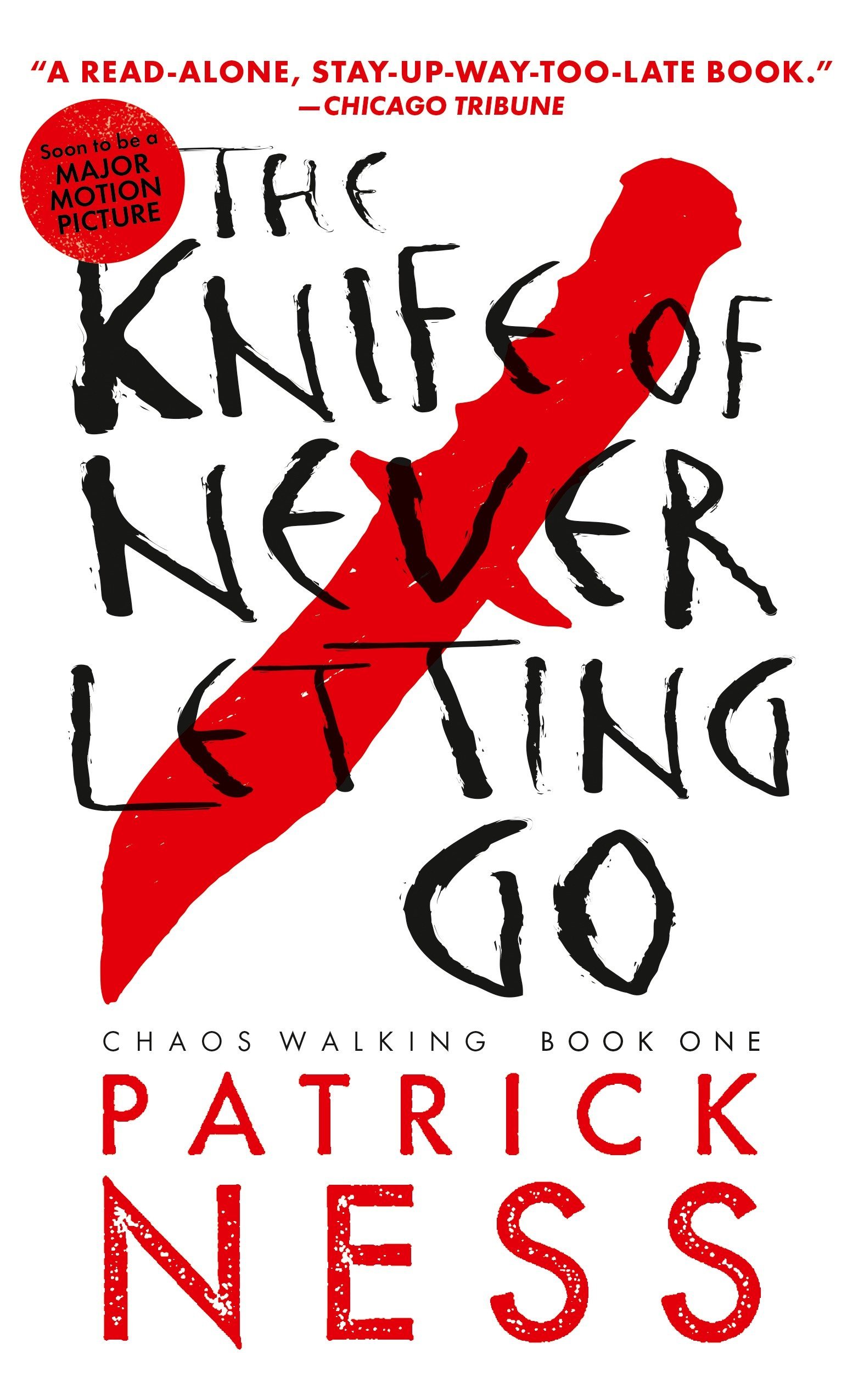
This type of ultra-crowded design can produce impressions of chaos and disorganization, as well a potential sense of dark dissonance. This can be useful, for creating tension!
On covers such as such as the one to the left, The Knife of Never Letting Go, the black, almost serial-killer-scrawl-esque font paired with scarlet knife silhouette on a paper white background sets the tone of the book to be an unsettling, almost psychological thriller. The contents of the book take that atmosphere and run with it, and the story does not disappoint.
As you can see, just with these 2 styles, there is a limitless number of things you can accomplish to attract attention and set the tone for your new bestseller. Thank you for your time!
Interesting review! I agree with you that the cover page sets the tone of a book before you even flip to any of the pages, and utilizing color correctly is a good way to do that. I'm curious if you've ever seen a cover that foreshadows events in the book or one that uses some kind of symbolism that relates to events in the story?
ReplyDeleteActually, there are quite a few that do this among my top favorite books. Disregarding the painfully abstract covers of most YA fiction books, there are, especially within the fantasy/science-fiction genres, many books that use this technique to gain intrigue and garner attention. For example, the Keeper of the Lost Cities series covers are all semi-spoiled scenes, but minus any context so no events or information is actually given away. One of my all time favorite writers, Rick Riordan, does a similar thing with pretty much every one of his book covers, and because they usually involve one of the climax action scenes (albeit again, really out of context as to avoid spoiling), the covers become a masterpiece of catching reader eyes.
DeleteNot to insult other blogs, but this was one of the few posts that I really enjoyed reading. Even though it's not a typical book review, I can tell that you took time to research and think about what you wrote. Despite cliche sayings, I think most people end up judging books by their covers so It makes sense that authors and publishers would research what draws the most attention. Nice job.
ReplyDeleteThough I haven't read your first blog post on book covers, I still enjoyed reading your review.
ReplyDeleteYour post was well-written and informative. You sound as if you know what you're talking about, and you also have examples and explanations for each example, which really help support your point.
This review struck me because one of the first things that I do when I go to the Champaign Public Library is go straight to the new books in the teen section and choose all of the books I think look interesting - so basically all of the books with what I deem as nice-looking covers. Now that I think about it, all of the books I checked out until now were books with the "crowded font" that you mention and bright, bold colors that drew my attention.
Great blog post!
I had read through your first blog post on book covers and I'm glad to see you continued it! I found this post to be very interesting to read as you brought up two different ways covers are designed to attract both attention and readers. Although this may be only me, I have actually not seen many books with millennial pink on their cover. Is there a specific genre that usually uses this color?
ReplyDeleteI actually mentioned this kind of in passing, but millennial pinks are usually used on book covers with more mature themes, or that are geared toward adults. The reason for this is that millennial pinks are a shade of pink that are not quite as energetic as pure pink, but more youthful than neutral tones such as beige or tan.
Delete